Sankey diagram
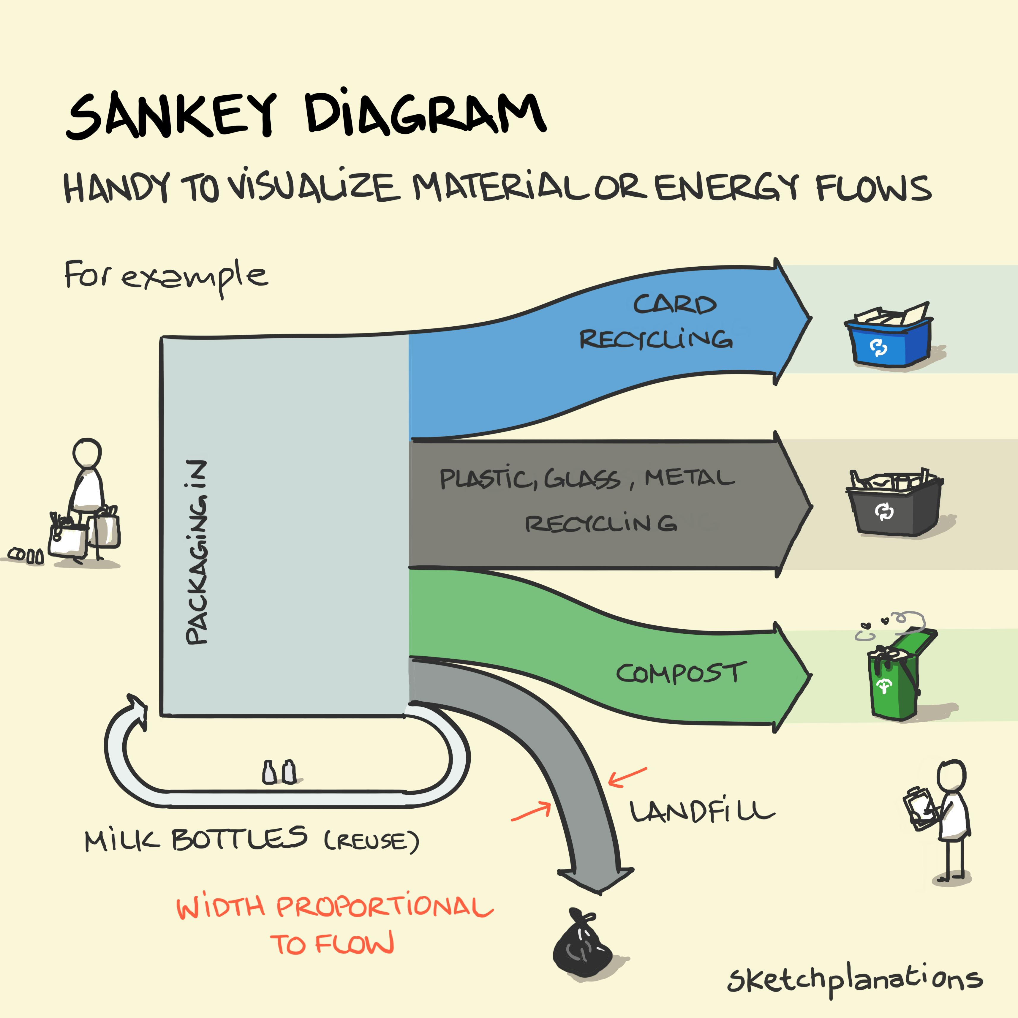
Sankey diagrams are handy ways to visualise material or energy flows through usage and time. They are excellent for displaying energy source and usage, for example the UK government publishes a Sankey diagram of UK energy each year (pdf).
Perhaps the most famous example is Charles Joseph Minard's remarkable visual showing Napoleon's invasion of and retreat from Russia in the Winter of 1812–13. In that chilling example the thickness of the lines represent the remaining size of Napoleon's army.
I learned about Sankey diagrams from Edward Tufte but perhaps people see them most commonly today in Google Analytics showing the different paths visitors take on a website before leaving.
You’re welcome to use and share this image and text for non-commercial purposes with attribution. Go wild!
See licence


