Sketchplanations

Explaining the world one sketch at a time

The magic of open-air kitchens for Asian street food shown calling out each aspect that makes it such an ingenious set up

The open-air kitchen

While travelling in Southeast Asia, I was in awe of the open-air kitchens of street restaurants. Just by wheeling out a few carefully stocked trolleys and some prepared ingredients, one person was able to run a bustling street-side restaurant serving a score of customers delicious, fresh-cooked food each night. It's a remarkable feat of ingenuity and efficiency. Some of the attributes I noticed about the best ones: Menus with prices visible from a distance We made some of the decision about whether a place looked good as we approached a stand. A clear menu with large prices you can see as you walk up is a simple way to slow down the right customers before they've walked past. Fresh ingredients on display Seeing the fresh ingredients at the front of the stall builds trust in what you're about to eat and whets the appetite. Pre-chopped ingredients and giant rice cooker Having boxes of pre-chopped ingredients to throw in makes cooking super speedy, and as so many dishes were served with rice, a single giant rice cooker enabled preparing meals in moments. Trolleys on wheels and everything within reach Having everything on wheels allows quick and easy deployment and packing up, and a chef can adjust each unit to have everything in easy reach. The right kit A single high-powered gas stove with a large wok cooks nearly all the dishes Trolleys stacked with plates, bowls, cups and utensils A waste bin handles scraps and excess liquids A multi-use towel wipes surfaces and hands We had a delicious meal from an old lady in Vietnam who'd just carried her entire restaurant on a bamboo pole over her shoulder, with two large baskets at either end. The pole held everything necessary to cook, including several small stools to sit and eat on. It helps to have the right kind of weather. A warm and generally dry climate means you don't need to rent indoor space, heat it or cover it. This enables so much creativity with food, reducing prices and barriers to entry and increasing selection. Alas, I'm in the UK for this one. It also suits food that is quick and simple to cook, often using pre-prepared, flavourful sauces and fresh ingredients that cook quickly, as opposed to dishes that require long preparation, ovens, or simmering times. Thai and Vietnamese food, in general, lend themselves well to this. It's remarkable how these simple yet effective setups can spin up a restaurant at the side of the street, turning a few trolleys, some carefully chosen gear and a talented chef into a culinary treat. Also see: Hedgehog a mango Cut an onion into teeny pieces Deseed a pomegranate Open a coconut Arrange kitchen storage to minimise excess travel Learn kind words first The kitchen working triangle 3 miscellaneous cooking tips And all sorts of other food and drink sketches
Read more…
The automation paradox explanation, or paradox of automation, summary with a hiker choosing their phone in place of a physical map and then getting lost in a landscape when there's no signal

The Automation Paradox

The Automation Paradox is that the better our machines get, the more we struggle when they fail. When heading out for a hike in the woods, it's tempting to skip the map and compass and rely on our phones and apps for navigation. Yet when we encounter no signal or lose power, we can find ourselves in a sticky situation. Or perhaps, like me, you've come to rely on popping your destination into the satnav or Google Maps whenever you get in the car and have nearly forgotten the ability to navigate without it. These situations illustrate the paradox of automation, where the more sophisticated and automated our machines and technologies become, the more bewildered we find ourselves when they inevitably fail. Or: the smarter the machines get, the dumber we might get. In his book Messy, Tim Harford suggests three strands to the paradox as our machines get more sophisticated: Automation covers up our mistakes, hiding our incompetence, meaning we may not learn to correct ourselves—consider autocorrect cleaning up our typos as we go. When we rely on automation, we get less practice for our skills, so even highly skilled individuals may find their expertise diminishing—perhaps you've found yourself using your phone calculator for a trivial calculation. When the easy scenarios are taken care of, failures may occur in complex or unpredictable ways that we may find especially difficult to recover from—like a subtle but persistent failure in the steering of a passenger plane, recovering from a skid on an icy road, or when you're deeply lost in the wilderness. More sophisticated technology can even make it useless or more dangerous when it fails. Older cars used to be reparable forever. Now, if your vehicle fails, it's likely to need plugging in at the dealership to figure out what's up. How many electronic devices are thrown away because somewhere inside, some tiny loose connection or component makes the whole thing worthless? Were pilots and flight crews better prepared and able to improvise before the autopilot became ubiquitous? I often wish our devices would fail more like an escalator or an electric toothbrush. If an escalator fails, you can still walk up it. If your electric toothbrush dies, you can still use it to brush your teeth. These could be called Technology-Enhanced Products, perhaps. But when most of our devices die, they're often rendered worthless. Automation and sophisticated machines help me so much. I did use Grammarly to help check this post. I use Google Maps nearly every time I put in my destination to home, and I often use a calculator to check my maths. But I do pay attention to grammar corrections, bring a paper map when I can, and keep trying to do the maths in my head. But as Tim Harford explains it, we still face "the paradox of automation: the better the machines get, the more bewildered we are when the machines fail." Also see: The bus factor Normalisation of deviance Chaos monkey Know your tech Jevon's paradox The law of unintended consequences The Dunning-Kruger effect (send me proof of purchase of Big Ideas Little Pictures, and I'll send the sketch to you) More paradoxes: The coastline paradox The transparency paradox The Abilene paradox The paradox of choice The liar paradox Tolkein-style landscape inspired by the excellent Lord of Maps.
Read more…
Point Nemo - the furthest point from land shown on the earth with the nearest three landmasses, Ducie Island, Moto Nui and Maher Island. This would be a long swim.

Point Nemo

Point Nemo is the furthest point in the ocean from any land. Imagine falling overboard and needing to swim to the nearest shore; the longest possible swim would start at Point Nemo. This puzzle, known as the Longest Swim Problem, finds its solution far into the Pacific Ocean at Point Nemo. The furthest point from land is a point with a maximum equal distance to three points of land. If you moved in any direction from there, you'd be closer to one of the points. The three nearest landmasses to Point Nemo, each about 2,688 km away, are: Dulcie Atoll in the Pitcairn Islands Moto Nui, a small islet off the coast of the well-known Rapa Nui (Easter Island) Maher Island, off the coast of Antarctica If you’ve ever been somewhere with only the sea in all directions, imagine what it would feel like to begin a 2,688 km swim from there. The antipode to Point Nemo, the point directly opposite it on Earth's surface, lies somewhere in Kazakhstan. Croatian survey engineer Hrvoje Lukatela identified and named Point Nemo after Captain Nemo from Jules Verne's classic "Twenty Thousand Leagues Under the Sea." Lukatela faced challenges in determining its exact coordinates, such as choosing the edge of Ducie Atoll's tidal sandbar and Maher Island being beneath ice for most of the year. Being so remote, space agencies use the area around Point Nemo as a spacecraft cemetery, sending old satellites and space debris to fall there. Likely, the closest people to Point Nemo are often those in the International Space Station passing overhead a mere 400km above. Point Nemo is also known as the Oceanic Pole of Inaccessibility. In contrast, the continental point of inaccessibility—the point on land furthest from the ocean—is in northwestern China near Kazakhstan, a remarkable 2,645 km from the nearest shore. Point Nemo has a lovely spread in Simon Kuestenmacher's book Marvellous Maps. Writing about Point Nemo makes me want to rewatch Life of Pi (and listen to the captivating music). Also see: The three tallest mountains The coastline paradox Antipodes Know your poles Orbit
Read more…
Iceberg floating orientation explained: Icebergs are usually drawn floating vertically, while a stable iceberg orientation is usually on its side

Iceberg orientation

Nearly every iceberg you see in a picture or diagram is probably floating the wrong way. This was what I learned (from Megan Thompson-Munson) after sketching Biz Stone's brilliant saying about the myth of overnight success. With some approximation, the density of ice is around 900 kg/m3, and seawater is around 1,000 kg/m3. Therefore, the fraction of an iceberg that's submerged is around ~900/1000 or 0.9. So, about 90% of an iceberg is below the surface and 10% above, which is partly why they can be so dangerous. While most iceberg pictures get this part more or less correct, most of these icebergs will be floating vertically. In reality, a tall, thin iceberg will likely topple, so most icebergs end up floating on their side, not their tips, even though we rarely draw them this way. I remember learning about a fascinating experiment with children of different ages estimating which glass holds more water: a tall, slender one filled high or a wider glass filled to a lower level. Younger children almost always chose the glass with the higher water level as the most water, even when it was significantly less than the shorter and wider glass. I wonder if it's part of why we draw icebergs vertically, at least when we're using them as a metaphor. It's easier to grasp quantities vertically, and we commonly underestimate volume spread over a wider area. We may still want to draw our icebergs tall and deep to make our point, but now, at least, we can do so with the knowledge that they're not like the real ones. If you want to see it yourself, Joshua Tauberer made a brilliant draw-an-iceberg-and-see-how-it-will-float game. I recommend you give it a go so it sinks in forever (sorry). Also see: Overnight success Why ice doesn't sink Ice-cream, gelato, sorbet Know your poles: penguins or polar bears, frozen ice or land
Read more…
Pillars of hope, steel starter bars or starter rods stick out of a house so that in the future it's easier to add an extra storey

Pillars of hope

"Pillars of Hope" is a tongue-in-cheek name for steel starter bars, also known as starter rods or rebar extensions, that protrude from the roofs of houses after construction. Leaving starter bars sticking out is a pragmatic approach, saving time and money when adding the next floor, as the structure is already partially prepared for the expansion. The "hope" in the name reflects the anticipation and optimism of adding to their homes in the future when the family grows or their financial situation improves. Growing up in the UK, I never encountered the practice of leaving exposed starter bars on houses. However, while travelling through Central America and Asia, I was surprised to see these exposed rods in many towns and cities. At first, I couldn't understand why so many buildings seemed unfinished, making the skyline somewhat messy. Only when someone explained their purpose to me did it make complete sense. Steel bars in concrete combine the tensile strength of steel with the compressive strength of concrete, creating a remarkably effective and widely used building method. The starter bars embedded in and protruding from the existing structure provide a strong and stable connection between a new addition and the existing building. The bars transfer loads and anchor the two together. Pillars of Hope are a conspicuous example of futureproofing. Other examples in buildings are electrics or plumbing, where you might leave capped-off pipes or electrical connection points in anticipation of future work. Laptops and desktop computers with empty expansion slots also use this approach, as does a first edition of software that includes an update manager. In software and agile development, I like the sentiment from the book Rework: "A kick-ass half is better than a half-assed whole." Have no parts of your product not yet working or "under construction" that are visible to users. Don't leave any visible "starter bars" sticking out of your product. And try not to solve problems that you don't yet have. While it might seem worth adding something now to make a future feature easier to build, it's a tricky balance. So often, you choose to do something else in the future instead and are left with some software pillars of hope sprinkled throughout your code—technical debt you may have to pay off later. While my first reaction to steel rods sticking out of houses seemingly willy-nilly was that it was chaotic and messy, when I think about them as Pillars of Hope I now find it kind of beautiful—looking out over a skyline and seeing the aspirations and future development of families, homes and a city sketched out on the rooftops. Edit: Several people told me that leaving starter bars sticking out of a roof makes the building 'unfinished' and not liable to tax on the work. While this is repeated in many places, I'm not 100% sure of the truth. If you have experience with it, please get in touch! Also see: Hope Hofstadter's Law Forcing functions for foolproofing
Read more…
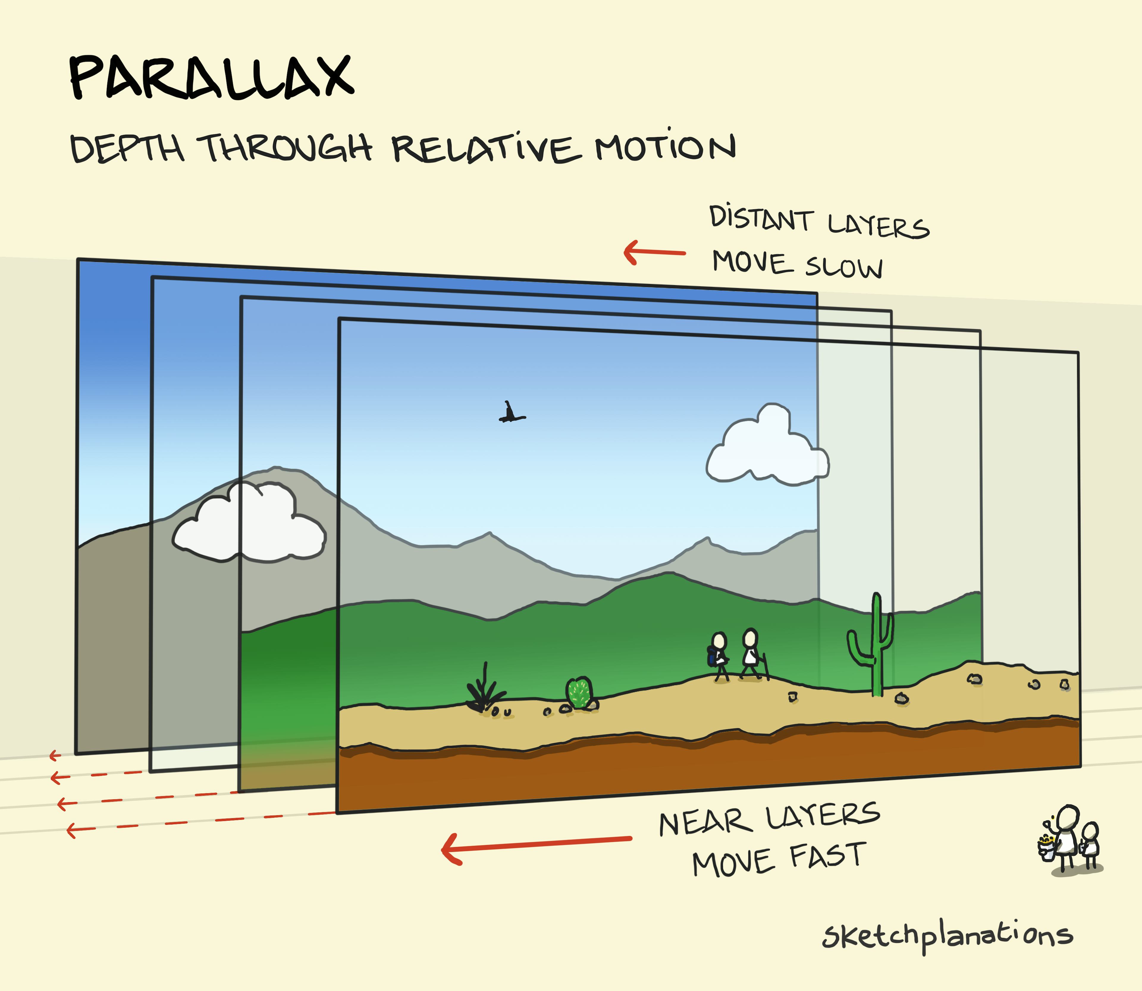
What is parallax explanation - how parallax works showing different layers moving at different speeds

Parallax

Parallax is the change in the apparent position of objects from different viewpoints. For example, from one viewpoint, a nearby house may appear in front of a hill, and from another, it may be in front of a lake. Objects at different distances appear to move by different amounts. As you move between viewpoints, say when driving along a road, nearby objects move past you quickly, while distant objects appear to move by slowly. This difference in motion from near to far objects helps us determine how far objects are away. I remember learning parallax from video games, like playing Sonic the Hedgehog on the old Sega Mega Drive. As the character moves in the foreground, elements at different distances in the background move progressively slower, creating a sense of depth. Saturation and contrast change at with distance also, known as atmospheric perspective. I also enjoy observing parallax while looking out of a train window; nearby hedges and trees race by, buildings in the middle distance move more slowly, and distant hills or mountains barely seem to change. It's fascinating how our brains interpret this relative movement to judge distances. One of the more intriguing applications of parallax is stellar parallax in astronomy. The basic geometry of parallax allows us to measure the distance of (relatively) nearby stars by observing relative shifts against the background of distant stars. Here's how it works: we observe the stars from different points in our orbit around the Sun. As a result, the stars appear to move relative to each other. By measuring this apparent shift, we can calculate the distance of the stars. Also see: Redshift The Doppler effect Atmospheric perspective Two-point perspective Pace layers Time hierarchy
Read more…
Word spectrum examples and explanation showing what is a word spectrum as gradations of description and examples of different word spectrums for size, frequency, talk volume, intelligence and taste

Word spectrum

A word spectrum highlights different aspects of a concept from one extreme to another. By arranging words on a spectrum, we can see their subtle differences and nuances. For example, a word spectrum of happiness might range from "Miserable" on one side to "Ecstatic" on the other, passing through "Gloomy", "Content", and "Happy" along the way. Or a word spectrum of tiredness might be: Asleep - Drowsy - Groggy - Awake - Alert - Energised It's not a science, and there's a fair amount of latitude for people to place different words in different positions. Looking at many spectrums, it strikes me that some writers excel at selecting specific and perhaps more intriguing words such as "scrumptious" or "mouth-watering" over the more common "delicious." Roald Dahl often had his characters "guzzle" instead of "eat hungrily," for example. I became curious about word spectrums when I realised that my understanding of the spectrum of approval was different from that of many of my American friends. In British English, "quite" is often used to mean "a bit less than," but in the U.S., I found it was more commonly used to mean "a lot" or "very." So, my British English word spectrum of approval would be: OK - Quite good - Good - Excellent While the word spectrum of approval for many of my U.S. friends might be: OK - Good - Quite good - Excellent It left me confused several times before I figured it out. For other variations in interpretation, such as where you might put "awesome", there's an excellent table as a Guide for U.S. students interpreting feedback from faculty trained in the U.K. (and vice versa). At times, it really matters what someone means with a descriptive word. In the "intelligence" trade "words of estimative probability" relate to specific odds meant by certain terms. For instance, if an attack is "highly likely," just how likely is it? If something is "almost certainly an airfield," how certain is that? Clearly, the choice and interpretation of these terms can be very significant. For a fascinating insight on this, see CIA analyst Sherman Kent's previously classified report Words of Estimative Probability (pdf). Other research has studied individual differences in people's perceptions of probability—and created some fun graphics showing the results. Estimative probability is also critical in medicine. If exact numbers aren't shared, how frequent is a side effect that occurs "rarely"? Specific guides have been created listing associated probabilities for terms such as "likely", "frequent", "occasional" and "rare". A reader also shared with me a classic chocolate advert of Fry's five boys, with the face of a boy moving from: desperation, pacification, expectation, acclamation and the realisation "it's Fry's". More word spectrums, including those illustrated here: Size: tiny - small - medium - large - huge - gigantic Frequency: never - rarely - occasionally - sometimes - often - always Talk volume: whisper - murmur - talk - shout - yell - scream Intelligence: stupid - dim - average - bright - brilliant - genius Tastiness: disgusting - bland - tasty - delicious Smell: foul - stinky - scented - sweet More fun scales and spectrums: Fahrenheit and Celsius The Bortle scale The fun scale Solar system scale The Scoville scale The square-cube law Do a 2x2
Read more…
Detecting prostate cancer summary - how screening for prostate cancer has changed DRA, PSA blood test and MRI screening compared in the old way and new way

Detecting prostate cancer: old way, new way

1 in 8 men in the UK get prostate cancer, according to the charity Prostate Cancer UK, and the risk of prostate cancer doubles if you're black. It's also the second most common cause of death from cancer for men in the UK, after lung cancer. Prostate cancer is not always life-threatening, but an early diagnosis can be life-saving. So, for Men's Health Week 2024, I worked with experts at Prostate Cancer UK to visualise how screening for and diagnosing prostate cancer has changed. In short, it's more accurate and safer than before and needn't rely on a chance conversation to trigger a discussion—you can do a 30s online check for your prostate cancer risk on the Prostate Cancer UK website right now. The new way has reduced reliance on the imperfect DRE (digital rectal examination—the test that might come to mind for many). After a suspicious PSA blood test result, you can be referred for a pre-biopsy MRI scan. Clinical trials show that pre-biopsy MRI triage can rule out 27% of men from having an unnecessary biopsy (a biopsy is when a doctor removes some cells for analysis). Biopsies have also improved and can now be guided by imaging, allowing doctors to identify the areas of the prostate they need to biopsy. It makes it safer and has fewer side effects. These changes, together, mean fewer unnecessary biopsies and diagnoses that find a higher proportion of clinically significant cancers over clinically insignificant cancers (which may not require treatment), meaning fewer men are at risk of harm from the screening. Rob Bell, host of the Sketchplanations podcast among many other talents, is an ambassador for Prostate Cancer UK, which supports our "dads, brothers, partners and friends by raising awareness, funding life-changing research, campaigning for change and providing much-needed support." Rob made the connection (this isn't a paid promotion), and you'll hear our discussion with Amy Rylance, Assistant Director of Health Improvement, on how screening has changed in this week's podcast. Medical research and knowledge is always changing. This sketch has been checked by the team at Prostate Cancer UK based on research. See, for example, the article Fewer Men Face Harm in Prostate Cancer Diagnosis. It's intended to raise awareness, help early diagnosis now or in the future for men reading this, and maybe even save a life. If you have feedback or comments on it, please do write to me: jono.hey@gmail.com Didn't know when Men's Health Week was? I learned that International Men's Health Week is the week preceding and including Father's Day. Don't forget, you (or someone you know or love) can do a 30s online prostate cancer risk check online now. Aside from helping your father avoid prostate cancer, he might like a copy of Big Ideas Little Pictures.   Also see: The Swiss Cheese model Dracula sneeze Reference: Most common causes of cancer death
Read more…
Loading more…
Buy Me A Coffee