Get my new weekly sketch in your inbox
Join over 30,000 people learning something new in a moment each Sunday.
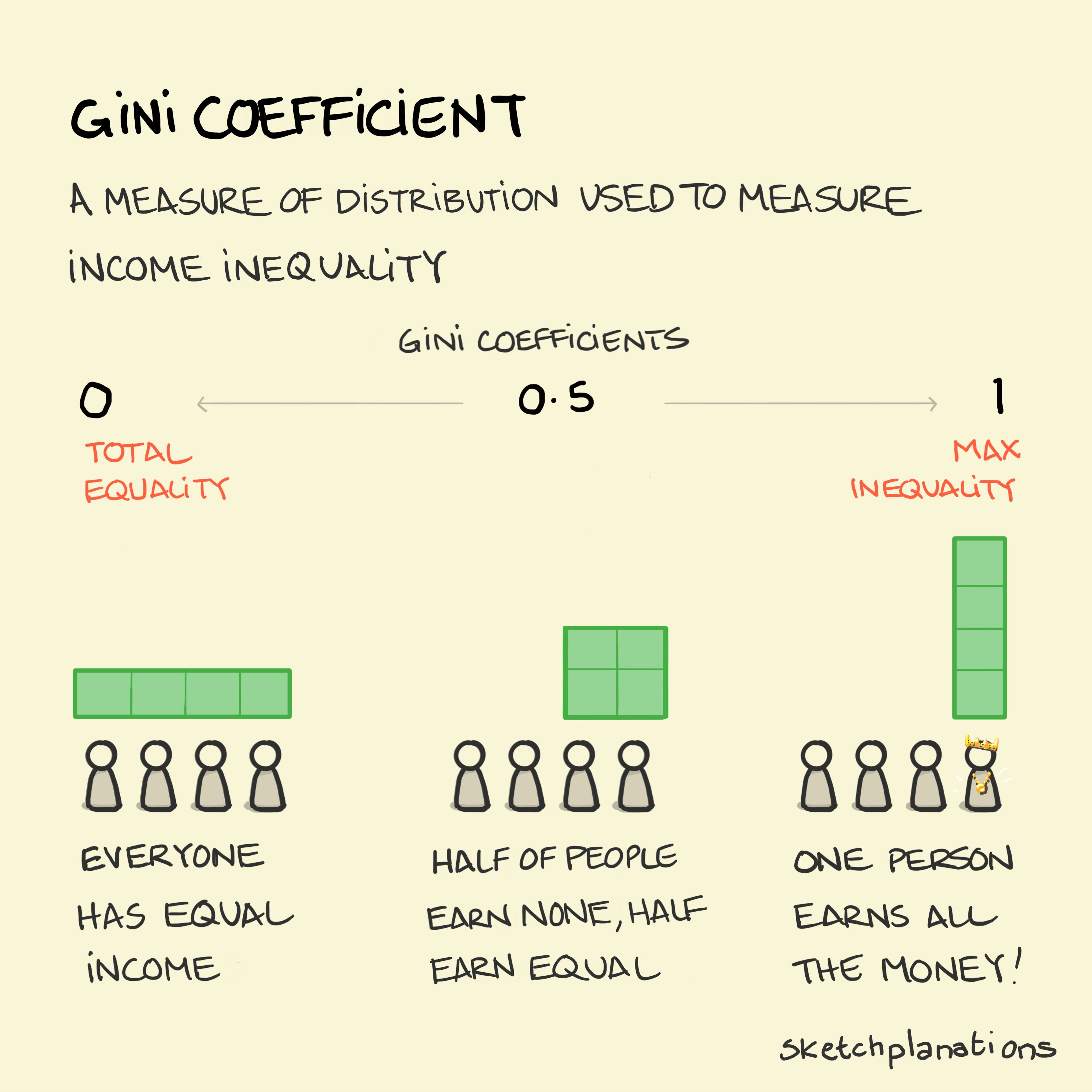
The Gini coefficient
The Gini coefficient, or Gini index, is a common way to gauge income or wealth inequality within a population.
The coefficient gives a single number showing how equal a distribution is. For example, in a population where everyone earns the same amount the Gini coefficient would be 0 — total equality — and in a population where one person earned all of the population's money, the Gini coefficient would be 1 (sometimes expressed as 100%) — maximum inequality. In practice all countries' Gini coefficients are somewhere in between, at around 0.25 to 0.5 after taxes.
Like any simple measure the Gini has its difficulties, like being easily misinterpreted when compared, but is still widely used. The BBC has a short piece on its history and an alternative measure called the Palma ratio.
Of course, we have some high profile zillionaires at the moment. You might like this old sketch of wealth inequality in America.
You’re welcome to use and share this image and text for non-commercial purposes with attribution. Go wild!
See licence